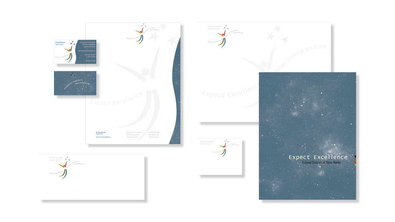
Emphasizing a top school district’s true character, Expect Excellence embodies their guiding principles. Their ideals were visually reinforced with a new logo to bring them from a Ye-Olde-Schoolhouse-look to a modern, forward-looking organization.
Die cut stars on the business card (upper left) relate the front character to “Expect Excellence” on the back. The gentle curve of the sky is reflected on the letterhead (center) and serves as a vertical die cut pocket on the inside of the folder (lower right).
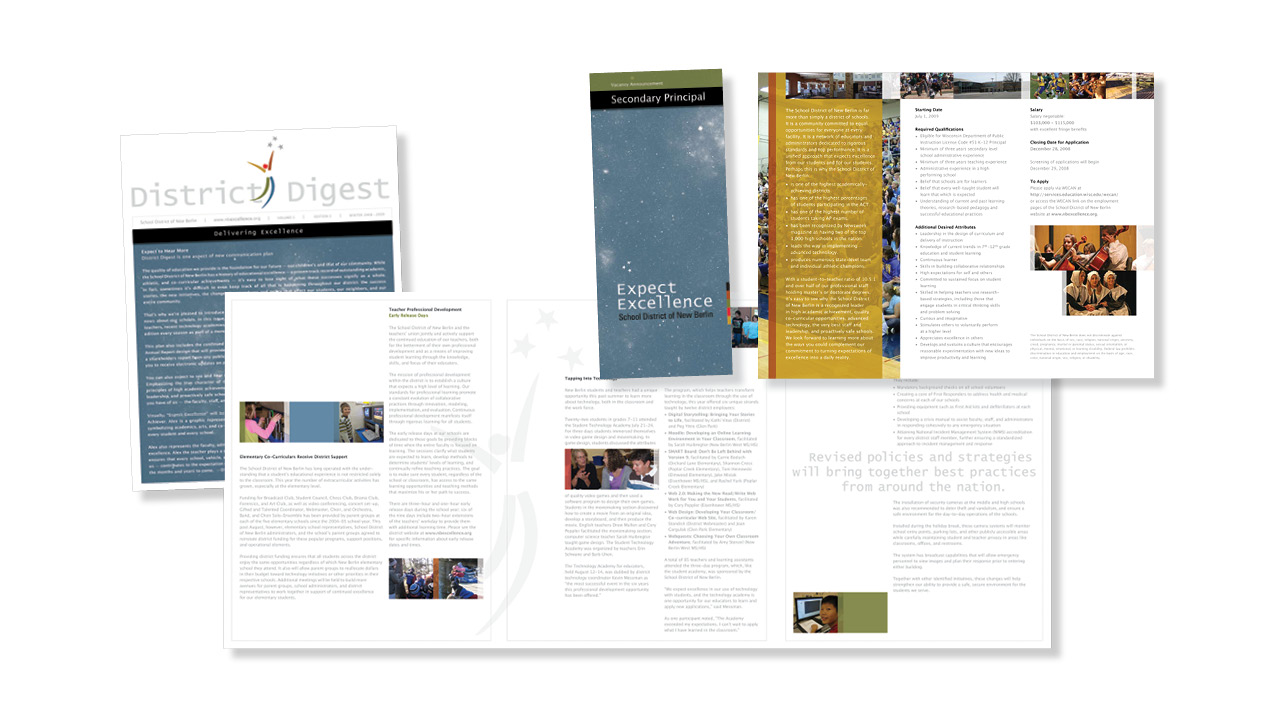
The Expect Excellence branding and logo were modified to embrace a community outreach newsletter (bottom). The branding is also maintained in brochures (upper) for upper level staff recruiting.
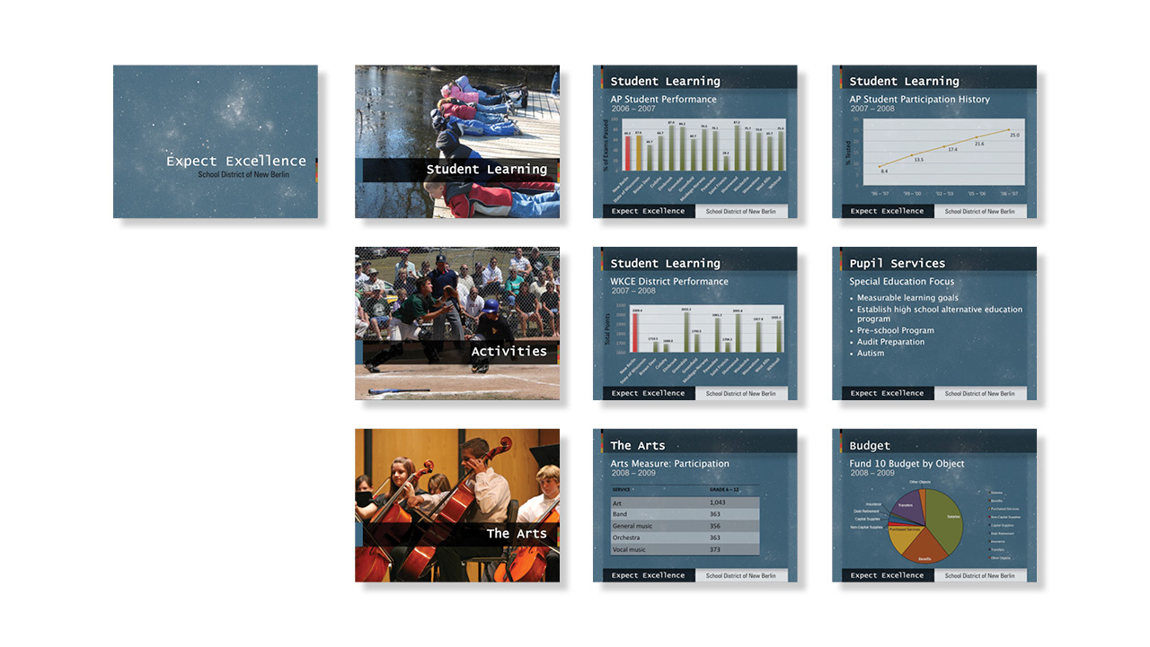
Between school board meetings, community outreach and staff communications, a cohesive Powerpoint presentation was critical for the success of the launch and continued support of Expect Excellence. Several sample slides are shown here.
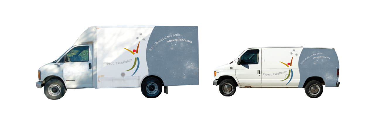
All the vehicles received a face lift maintaining the established design. Banners, flags and displays were added to unify all the schools. Staff clothing, outdoor signage, interior building modifications and displays and promotional items completed the branding package.


